DIY Your Teaching Slides
Harness Repeatable Lesson Structures,
Essential Tech How-Tos, and Basic Design Rules
to Make Effective Slide Lessons with Ease
Are you ready to teach online but stuck when it comes to getting the slides made?
DIY Your Slides
gives you a process and examples for developing your own presentation structures and go-to slide templates. The “tech hacks” lesson lays out how to add and layer text, shapes, borders, and custom elements. A final video introduces key design lessons for slide creation.

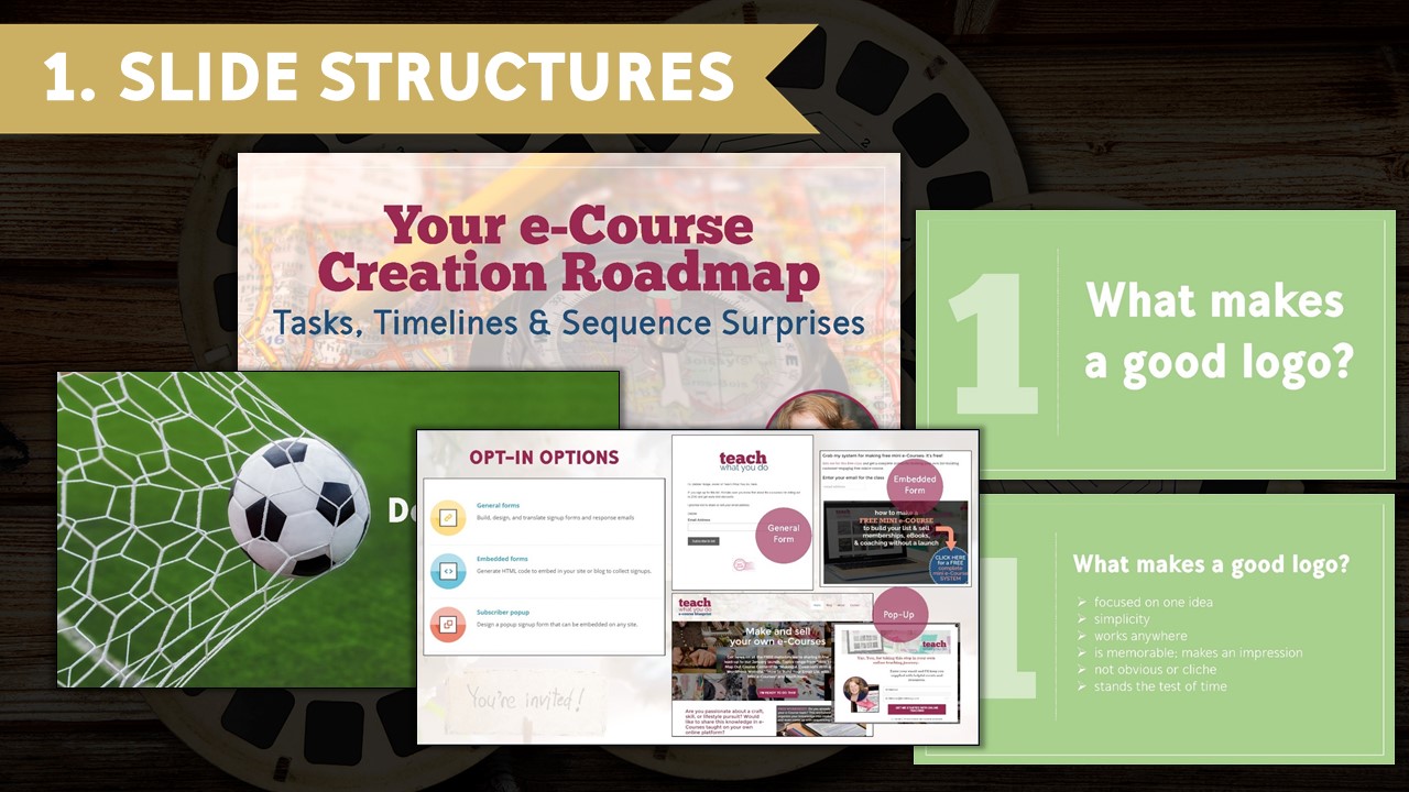
Making the slides that go along with a lesson or live presentation gets whole lot easier when you understand that there are a few basic slide types to most presentations. Think of these slide types as the elements that give your lesson or presentation its arc.
Understand 5 slide types to mix and match for your own presentations–plenty of examples for your own inspiration and styling.

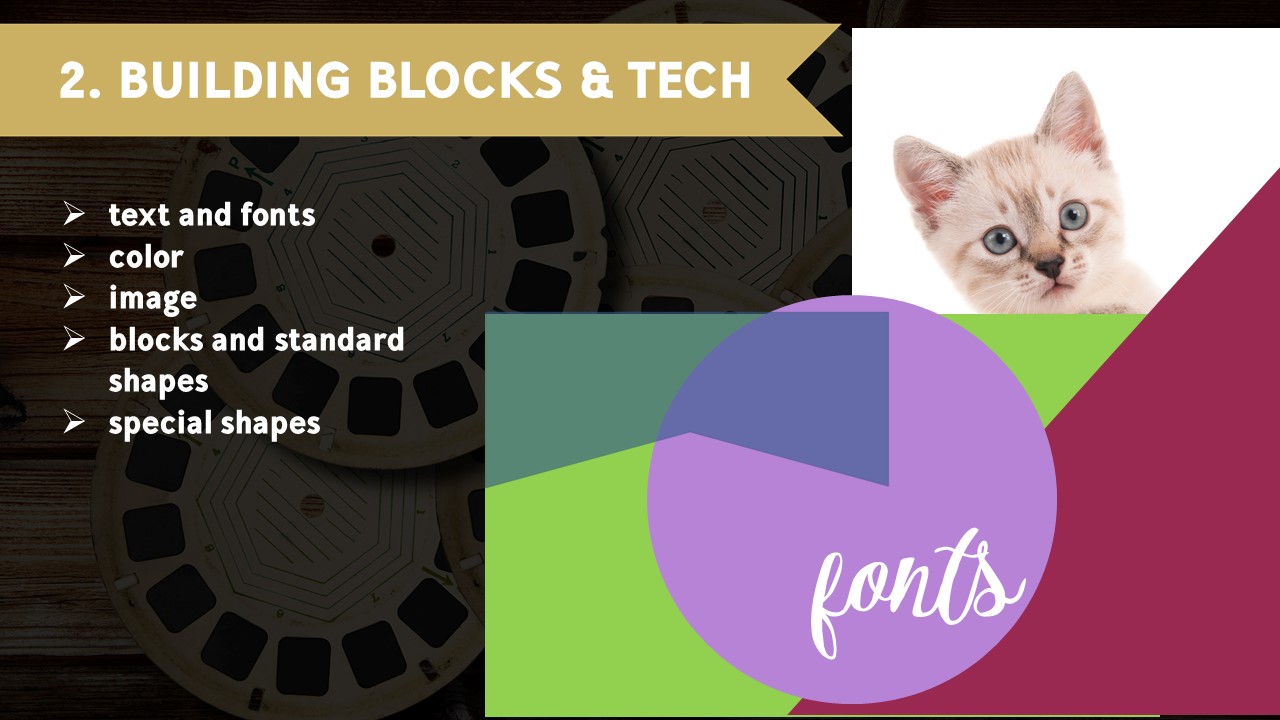
To make slides for class lessons and presentations, you have five basic elements to work with:
- text and the fonts the text is rendered in
- color
- images that you import as “pictures”
- blocks and standard shapes you can draw within your slide software
- special shapes that you can import as “pictures”
When you understand that these are your basic building blocks—as well as how to render, place and size those elements—the work becomes more clear. In this lesson we look at examples and how-tos for each of these elements. Demos are done with PicMonkey and Powerpoint. Principles translate easily to simple graphics tools like Canva and the slide software Keynote.

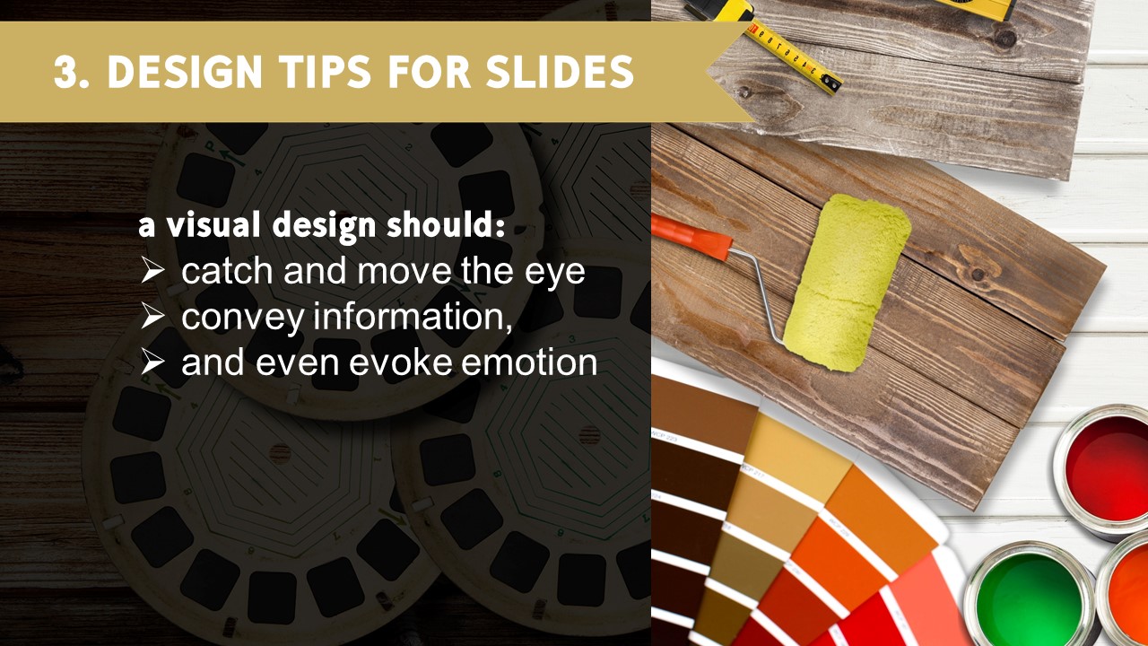
A strong visual design catches and moves the eye, conveys information, and even evokes emotion. Design principles are tools that help you achieve those ends. In this lesson, I walk you through the making of two quite different cover slides and how to apply basic design principles.

DIY Your Slides
$57
Privacy Policy | Disclaimer | Terms and Conditions | Contact
© 2016 Debbie Hodge, Teach What You Do. All Rights Reserved.